Types of CSS Units
In CSS, we use units to define the size of elements, and there are two main categories: absolute units and relative units.
Absolute Units:

These are fixed sizes that don’t change based on screen size or other elements:
- px (Pixels): The most common unit, used for on-screen designs. Pixels are small, fixed units of measurement.
p {
  font-size: 18px;
}- in (Inches): Typically used for print layouts, but you probably won’t use this much for web.
div {
  width: 1in;
}- cm (Centimeters), mm (Millimeters): Also used in print design. These units aren’t as common in web design.
div {
  height: 10cm;
}
Relative Units:
These units change size based on another element, making them more flexible and often better for responsive designs:
- % (Percentage): The size is relative to the parent element.
div {
  width: 50%; /* Takes up 50% of the parent element's width */
}- em: Relative to the font size of the parent element. If the parent’s font size is 16px, then
1.5emwould be 24px.
p {
  font-size: 1.5em; /* 1.5 times the parent’s font size */
}- rem: Similar to
em, but relative to the root element (the<html>tag).
p {
  font-size: 2rem; /* 2 times the root element's font size */
}- vw (Viewport Width): 1vw is equal to 1% of the viewport width (the browser window). This is great for responsive layouts.
div {
  width: 50vw; /* 50% of the viewport width */
}- vh (Viewport Height): 1vh equals 1% of the viewport height.
div {
  height: 100vh; /* Full height of the viewport */
}
Using Units in CSS
1. Width and Height:
You can define width and height using any of the units mentioned above. For example:
div {
  width: 100px; /* Fixed size in pixels */
  height: 50%;  /* Half the height of the parent */
}
2. Font Sizes:
Font size is typically defined using px, em, rem, or %, depending on your needs.
h1 {
  font-size: 3rem; /* Relative to the root element’s font size */
}
p {
  font-size: 16px; /* Fixed size in pixels */
}
3. Margins and Padding:
You can also set margins and padding using any of these units. This helps control the spacing around and inside elements.
div {
  padding: 20px;
  margin: 5%;
}
CSS Units Example Code
<!DOCTYPE html>
<html lang="en">
<head>
  <meta charset="UTF-8">
  <meta name="viewport" content="width=device-width, initial-scale=1.0">
  <style>
    body {
      font-size: 16px; /* Sets the base font size */
    }

    /* Using px for fixed sizing */
    h1 {
      font-size: 24px;
    }

    /* Using em for relative sizing */
    p {
      font-size: 1.5em; /* 1.5 times the base font size */
    }

    /* Using % for flexible width */
    div {
      width: 50%; /* Takes up half the width of the parent */
      padding: 1em;
      background-color: lightgray;
    }

    /* Viewport units for responsive design */
    .fullscreen {
      width: 100vw;
      height: 100vh;
      background-color: lightblue;
    }
  </style>
  <title>CSS Units Example</title>
</head>
<body>

  <h1>Understanding CSS Units</h1>
  <p>This text is sized with em units, relative to the base font size.</p>

  <div>This div takes up 50% of the width of its parent.</div>

  <div class="fullscreen">This div fills the entire viewport.</div>

</body>
</html>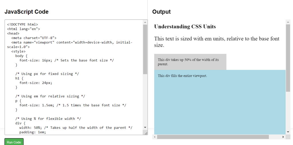
CSS Labs