Defining Grid Areas
The grid-template-areas property allows you to name specific areas of your grid and place items accordingly. This method makes you grid layout more readable and easier to manage.
- Setting Up Grid Areas:
In this example, we’ve defined a layout with areas for a header, sidebar, main cotent, and footer.

.grid-container {
    display: grid;
    grid-template-areas:
        'header header'
        'sidebar main'
        'footer footer';
    grid-gap: 10px;
}

.header {
    grid-area: header;
}
.sidebar {
    grid-area: sidebar;
}
.main {
    grid-area: main;
}
.footer {
    grid-area: footer;
}
Spanning Rows and Columns
Sometimes, you need elements to span multiple rows or columns. You can achieve this using the grid-column and grid-row properties.
- Spanning Multiple Rows/Columns:
.grid-item {
    grid-column: 1 / span 2; /* Spans 2 columns */
    grid-row: 1 / span 2; /* Spans 2 rows */
}
CSS Grid (Part 2 ) Example Code
<!DOCTYPE html>
<html lang="en">
<head>
    <meta charset="UTF-8">
    <meta name="viewport" content="width=device-width, initial-scale=1.0">
    <title>Advanced CSS Grid Example</title>
    <style>
        .grid-container {
            display: grid;
            grid-template-areas:
                'header header'
                'sidebar main'
                'footer footer';
            grid-gap: 10px;
            border: 2px solid #000;
            padding: 10px;
        }
        .header {
            grid-area: header;
            background-color: #4CAF50;
            color: white;
            padding: 20px;
            text-align: center;
        }
        .sidebar {
            grid-area: sidebar;
            background-color: #2196F3;
            color: white;
            padding: 20px;
        }
        .main {
            grid-area: main;
            background-color: #FFC107;
            color: white;
            padding: 20px;
        }
        .footer {
            grid-area: footer;
            background-color: #9C27B0;
            color: white;
            padding: 20px;
            text-align: center;
        }
    </style>
</head>
<body>
    <div class="grid-container">
        <div class="header">Header</div>
        <div class="sidebar">Sidebar</div>
        <div class="main">Main Content</div>
        <div class="footer">Footer</div>
    </div>
</body>
</html>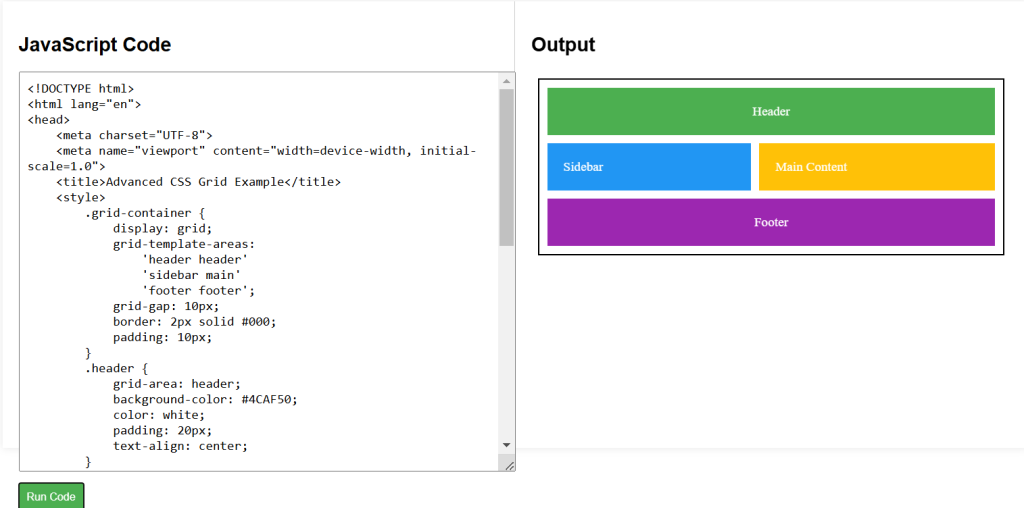
CSS Labs