Understanding the Grid Container and Grid Items
The CSS Grid layout is based on a grid container that holds grid items. The grid container is defined using the display: grid; property.
- Defining a Grid Container
In this example, .grid-container sets up a grid with two columns of equal width and a gap between items.

.grid-container {
    display: grid;
    grid-template-columns: 1fr 1fr; /* Defines two equal-width columns */
    grid-template-rows: auto; /* Rows will adjust to the height of their content */
    gap: 10px; /* Adds space between grid items */
}
Placing Grid Items
Grid items are placed within the grid container using the grid-column and grid-row properties.
- Placing Items in Specific Grid Areas:
.item-1 {
    grid-column: 1 / 2; /* Places the item in the first column */
    grid-row: 1 / 2; /* Places the item in the first row */
}
.item-2 {
    grid-column: 2 / 3; /* Places the item in the second column */
    grid-row: 1 / 2; /* Places the item in the first row */
}
CSS Grid (Part 1) Example Code
<!DOCTYPE html>
<html lang="en">
<head>
    <meta charset="UTF-8">
    <meta name="viewport" content="width=device-width, initial-scale=1.0">
    <title>CSS Grid Example</title>
    <style>
        .grid-container {
            display: grid;
            grid-template-columns: 1fr 1fr; /* Defines two equal-width columns */
            gap: 10px; /* Adds space between grid items */
            border: 2px solid #000;
            padding: 10px;
        }
        .grid-item {
            background-color: #4CAF50;
            color: white;
            padding: 20px;
            text-align: center;
        }
    </style>
</head>
<body>
    <div class="grid-container">
        <div class="grid-item">Item 1</div>
        <div class="grid-item">Item 2</div>
        <div class="grid-item">Item 3</div>
        <div class="grid-item">Item 4</div>
    </div>
</body>
</html>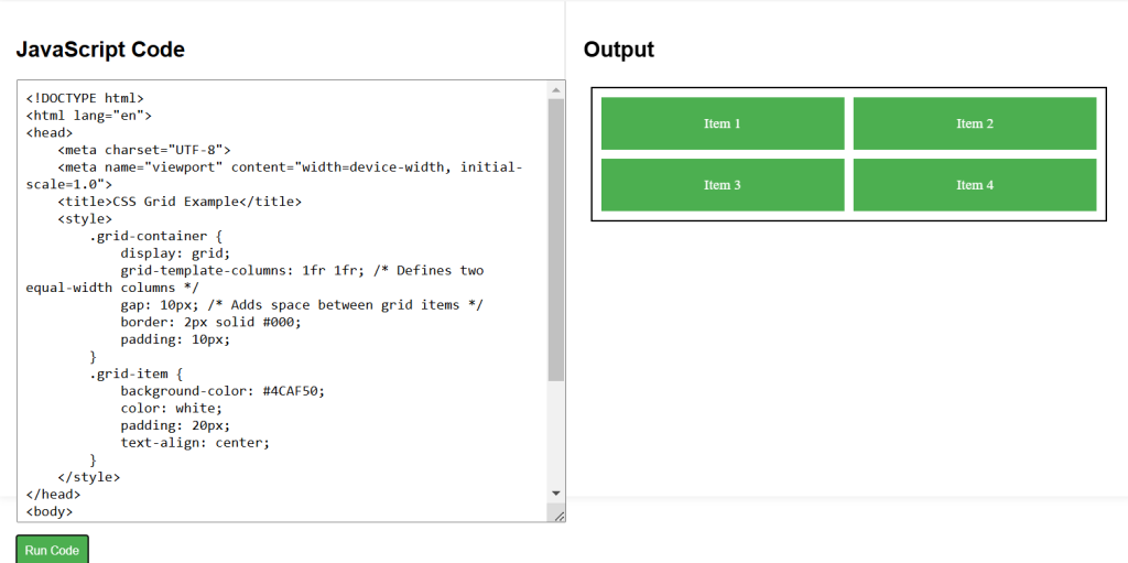
CSS Labs