Understanding the Flex Container and Flex Items
The Flexbox model consists of a flex container and flex items. The container is defined using the display: flex; property, and the child elements become flex items.
- Defining a Flex Container:
In this example, .flex-container is the parent element that will hold the flex items.

.flex-container {
    display: flex;
    border: 2px solid #000;
    padding: 10px;
}
Flex Direction
The flex-direction property specifies the direction in which the flex items are placed in the container. The common value are row and column.
- Setting Flex Direction:
This example sets the flex items to be placed in a row (horizontally) or a column (vertically).
.flex-container {
    display: flex;
    flex-direction: row; /* or column */
}
CSS Flexbox (Part 1) Example Code
<!DOCTYPE html>
<html lang="en">
<head>
    <meta charset="UTF-8">
    <meta name="viewport" content="width=device-width, initial-scale=1.0">
    <title>CSS Flexbox Example</title>
    <style>
        .flex-container {
            display: flex;
            flex-direction: row; /* Change to column for vertical layout */
            border: 2px solid #000;
            padding: 10px;
        }
        .flex-item {
            background-color: #4CAF50;
            color: white;
            padding: 20px;
            margin: 10px;
            text-align: center;
        }
    </style>
</head>
<body>
    <div class="flex-container">
        <div class="flex-item">Item 1</div>
        <div class="flex-item">Item 2</div>
        <div class="flex-item">Item 3</div>
    </div>
</body>
</html>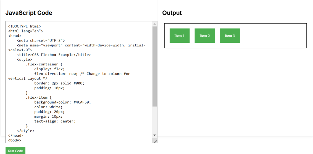
CSS Labs