Aligning Items and Content
Flexbox provides properties to align items and content within the flex container.

align-items: Aligns flex items along the cross axis (vertically in a row, horizontally in a column).
.flex-container {
    display: flex;
    align-items: center; /* Aligns items to the center of the container */
}justify-content: Aligns flex items along the main axis (horizontally in a row, vertically in a column).
.flex-container {
    display: flex;
    justify-content: space-between; /* Distributes space evenly between items */
}align-content: Aligns lines of flex items when there’s extra space in the cross axis.
.flex-container {
    display: flex;
    align-content: space-around; /* Distributes space around items */
}
Flexible Sizing with Flex-grow, Flex-shrink, and Flex-basis
These properties allow you to control how flex items grow, shrink, and set their initial size.
flex-grow: Defines how much a flex item should grow relative to the rest.
.flex-item {
    flex-grow: 2; /* Item will grow twice as much as others */
}flex-shrink: Defines how much a flex item should shrink relative to the rest.
.flex-item {
    flex-shrink: 1; /* Default value, allows item to shrink if needed */
}flex-basis: Defines the initial size of a flex item before any space distribution occurs.
.flex-item {
    flex-basis: 100px; /* Sets the initial size to 100px */
}
CSS Flexbox (Part 2) Example Code
<!DOCTYPE html>
<html lang="en">
<head>
    <meta charset="UTF-8">
    <meta name="viewport" content="width=device-width, initial-scale=1.0">
    <title>Advanced Flexbox Example</title>
    <style>
        .flex-container {
            display: flex;
            flex-direction: row;
            align-items: center;
            justify-content: space-between;
            height: 200px;
            border: 2px solid #000;
            padding: 10px;
        }
        .flex-item {
            background-color: #4CAF50;
            color: white;
            padding: 20px;
            margin: 10px;
            text-align: center;
            flex-grow: 1;
            flex-shrink: 1;
            flex-basis: 100px;
        }
    </style>
</head>
<body>
    <div class="flex-container">
        <div class="flex-item">Item 1</div>
        <div class="flex-item">Item 2</div>
        <div class="flex-item">Item 3</div>
    </div>
</body>
</html>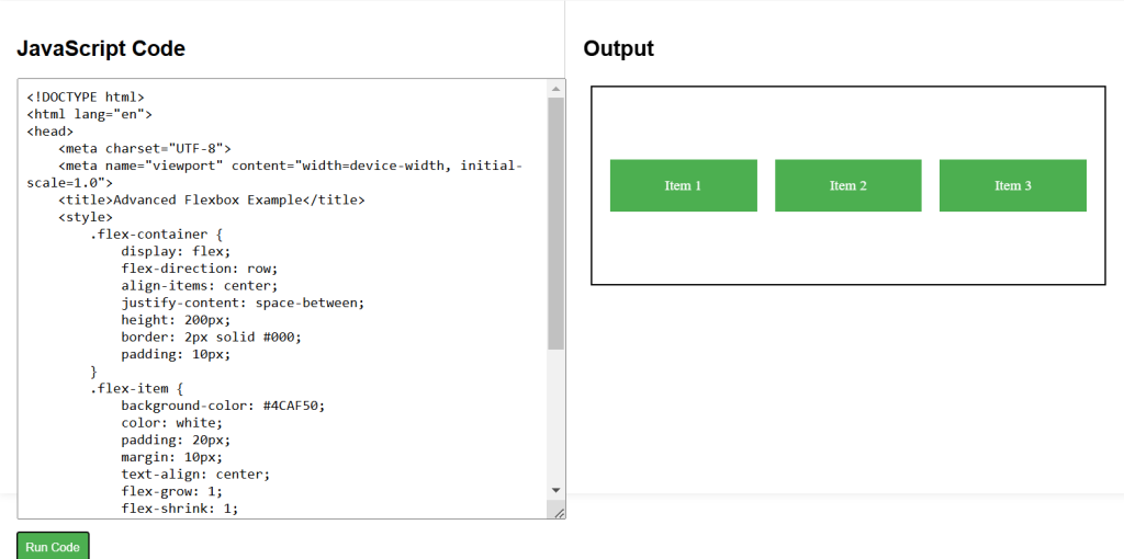
CSS Labs