Understanding Keyframes
Keyframes define the start and end states of an animation, as well as any intermediate points. You use the @keyframes rule to create these keyframes.
- Basic Usage
This example creates a fadeIn animation that transitions an element’s opacity from 0 to 1 over 2 seconds.

@keyframes fadeIn {
    from {
        opacity: 0;
    }
    to {
        opacity: 1;
    }
}

.fade-in {
    animation: fadeIn 2s; /* Applies the fadeIn animation over 2 seconds */
}
Applying Animation Properties
You can control various aspects of the animation using properties like animation-duration, animation-timing-function, animation-delay, and animation-iteration-count.
In this example, the .slide-in class applies a sliding animation that moves an element from off-screen to its original position. The animation lasts for 3 seconds, starts after a 1-second delay, and repeats infinitely.
.slide-in {
    animation-name: slideIn;
    animation-duration: 3s;
    animation-timing-function: ease-in-out;
    animation-delay: 1s;
    animation-iteration-count: infinite; /* Repeats the animation infinitely */
}

@keyframes slideIn {
    from {
        transform: translateX(-100%);
    }
    to {
        transform: translateX(0);
    }
}
CSS Animations Example Code
<!DOCTYPE html>
<html lang="en">
<head>
    <meta charset="UTF-8">
    <meta name="viewport" content="width=device-width, initial-scale=1.0">
    <title>CSS Animations Example</title>
    <style>
        .container {
            width: 300px;
            margin: 50px auto;
            text-align: center;
        }
        .fade-in {
            width: 100px;
            height: 100px;
            background-color: blue;
            animation: fadeIn 2s;
        }

        @keyframes fadeIn {
            from {
                opacity: 0;
            }
            to {
                opacity: 1;
            }
        }
    </style>
</head>
<body>
    <div class="container">
        <div class="fade-in">Watch me fade in!</div>
    </div>
</body>
</html>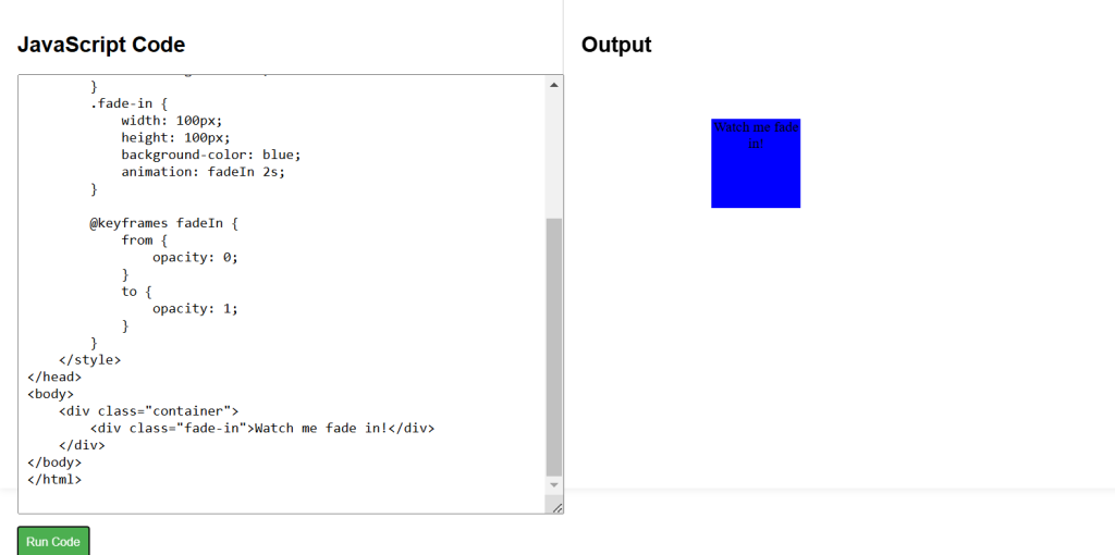
CSS Labs