Understanding the Transition Property
Transitions in CSS let you change property values over a specified duration. The transition property is shorthand for transition-property, transition-duration, transition-timing-function, and transition-delay.
- Basic Usage
In this example, the .box element will smoothly transition its background color to green and its width to 200px over 2 seconds when hovered.

.box {
    width: 100px;
    height: 100px;
    background-color: blue;
    transition: background-color 2s, width 2s; /* Change background color and width over 2 seconds */
}

.box:hover {
    background-color: green;
    width: 200px;
}
Timing Function
The transition-timing-function property allows you to define the speed curve of the transition effect.
- Common Values:
ease: Starts slow, speeds up, then slows down at the end.linear: Constant speed from start to finish.ease-in: Starts slow, then speeds up.ease-out: Starts fast, then slows down.ease-in-out: Starts and ends slowly, with speed up in the middle.
.box {
    transition: width 2s ease-in-out; /* Smoothly changes width, starting and ending slowly */
}
CSS Transitions Example Code
<!DOCTYPE html>
<html lang="en">
<head>
    <meta charset="UTF-8">
    <meta name="viewport" content="width=device-width, initial-scale=1.0">
    <title>CSS Transitions Example</title>
    <style>
        .container {
            width: 300px;
            margin: auto;
            text-align: center;
            margin-top: 50px;
        }
        .box {
            width: 100px;
            height: 100px;
            background-color: blue;
            margin: 20px auto;
            transition: background-color 2s, width 2s;
        }
        .box:hover {
            background-color: green;
            width: 200px;
        }
    </style>
</head>
<body>
    <div class="container">
        <div class="box">Hover over me!</div>
    </div>
</body>
</html>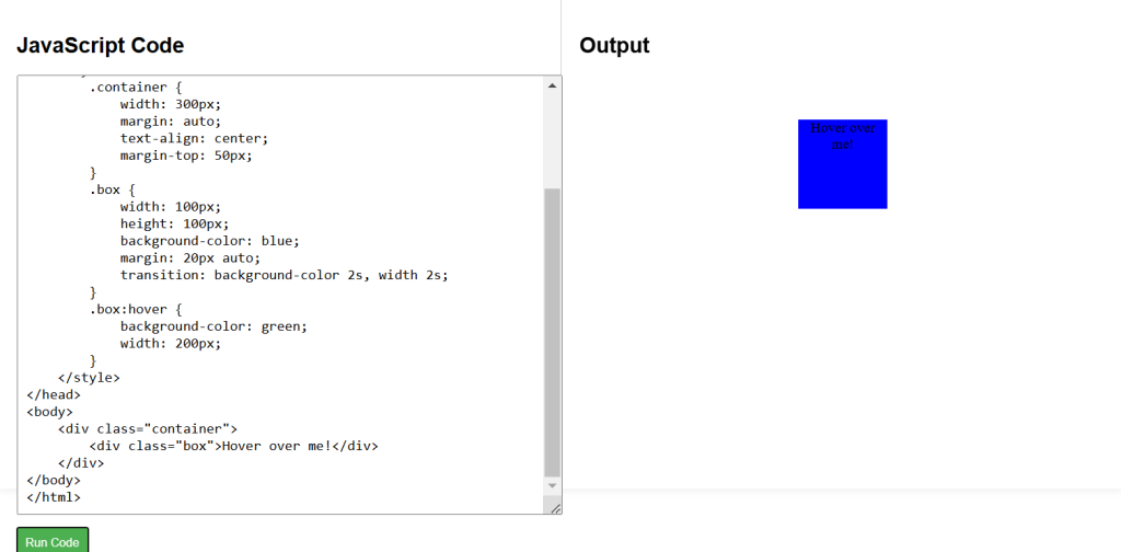
CSS Labs